
THE ASK:
I attended a risograph workshop at Matiz Press where we brought in 5-10 sec clips to turn into a two-color risograph animation. I’m obsessed with playing Guitar Hero so I wanted mine to be about that. But the most iconic part about that game is the five colored buttons, so how was I going to portray that through a 2-color print?
The Solution:
I filmed footage of myself playing Guitar Hero with my favorite circular shades reflected in the glasses. When preparing the clip to be a riso sequence, I stylized the footage to have a rugged posterized look and left the buttons blank for me to go in and color with markers and pens after the sequence was printed on two contact sheets.
how:
Risograph Printmaking (bright red and teal ink), Spectrolite, marker and pen coloring, After Effects, Scanning, Adobe Illustrator cropping, Compositing
Process
This footage was recorded back when I played on Hard difficulty. These days, I'm really good at Expert.
One random night when I was still living at home with my parents, I had a cool idea for a shot, so I set up my phone on the TV stand, angled my sunglasses to make sure the game reflected well on them, and started recording.
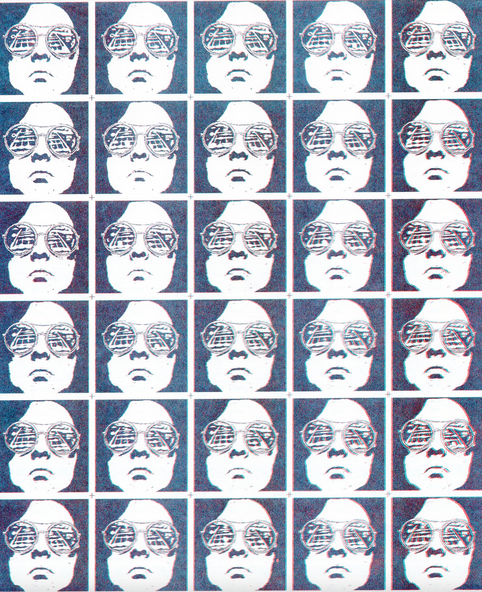
Contact sheet before color
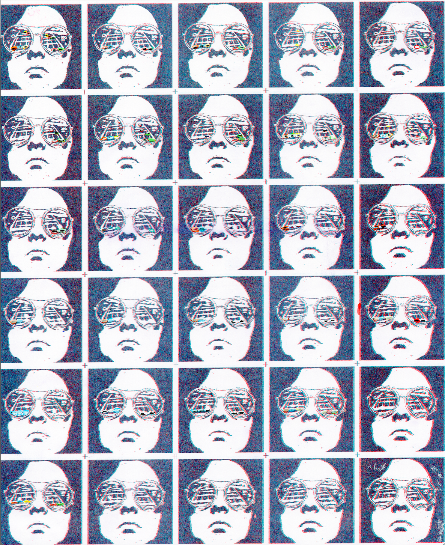
Color tests
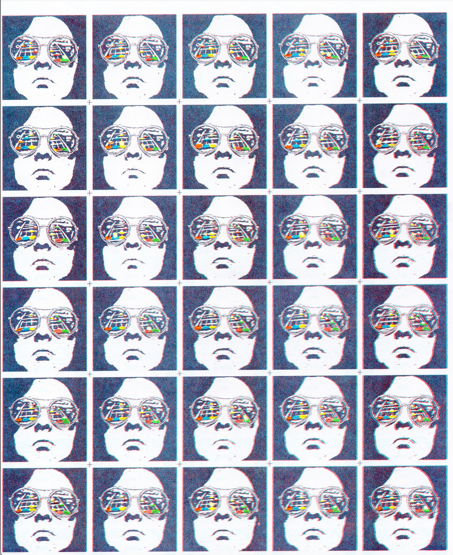
Final contact sheet pg. 2
After testing markers to find the most color-accurate markers in my random assortment of childhood art supplies, I tested out ways how to apply them on the excess copies before coloring the real sequence.
my findings throughout the process
1
Black marker was too overbearing for the center of the front buttons considering how the main print wasn’t even printed in black, just a mix of teal and red. Pencil wound up achieving the most accurate hue to the in-game interface while being light enough to blend well with the colors, not to mention its streaky quality felt more hard rock when animated.
2
I needed to break down the raw reference footage in an image sequence to use as a reference for how to color each frame to capture the minute details that sell the feel of playing the game. Creative risk-taking with some guardrails for quality control!
3
The flames after you hit a note are what makes the game so satisfying and addicting. I initially left the flames alone because I figured that was bright enough to stand out and feel accurate. After scanning the fully colored contact sheets, I found that they needed more oomph to stand out among all that was going on, so I added some yellow highlighter in the spaces meant for the flames to make them pop. The highlighter was a neon hue that was brighter than the yellow I used for the buttons, so there was visual differentiation in their purposes.