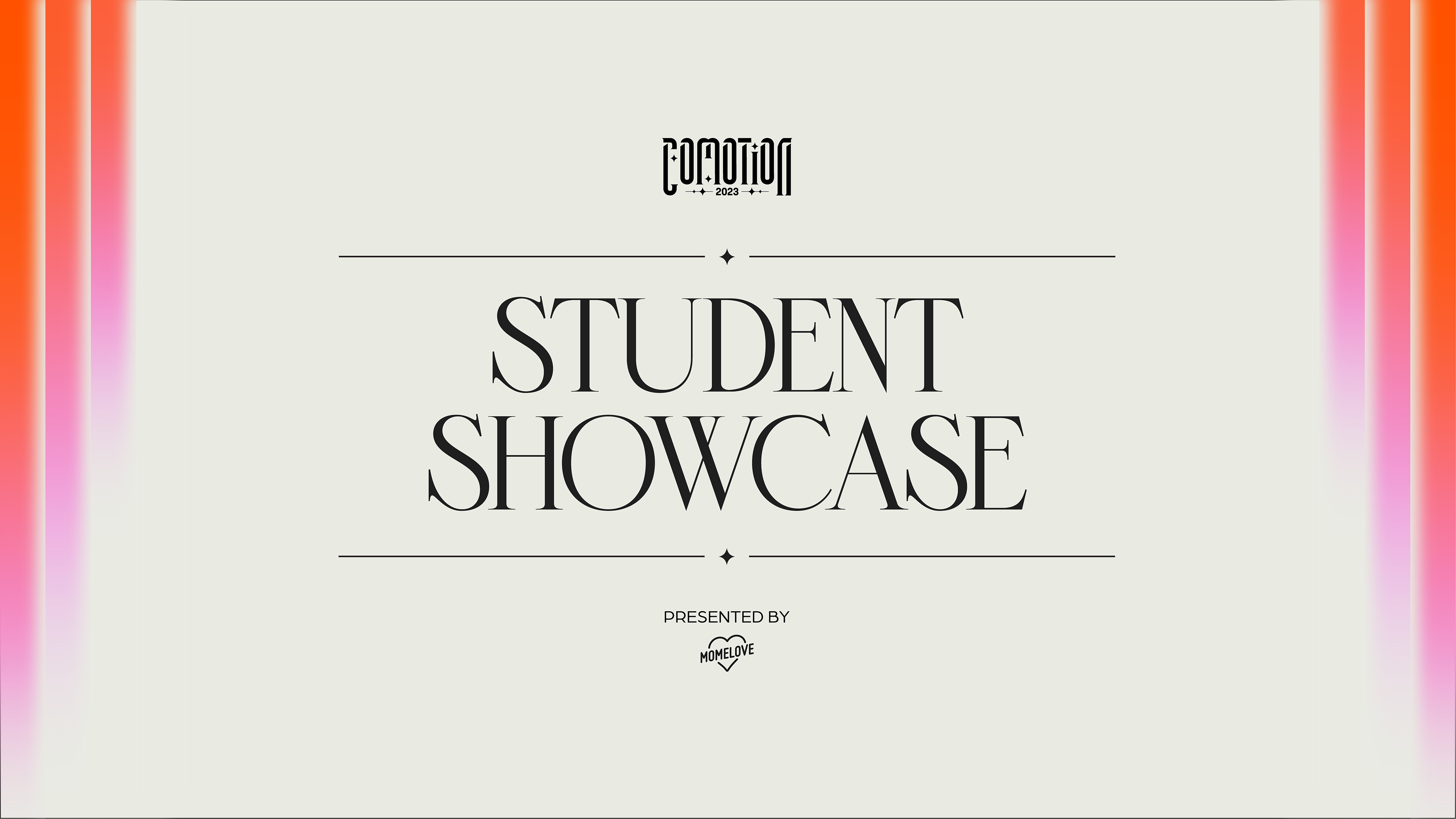
CoMotion is a student-led motion graphics conference that brings together top industry professionals with Motion Media Design students at the Savannah College of Art and Design. The event includes a keynote speech, panel discussions, the annual curated and juried Student Showcase, 1-on-1 portfolio reviews, and an award ceremony.
Back in October 2022, my friends Aanvik Singh and Marly Koven asked me for help in developing the logo for their pitch for CoMotion 2023. This pitch wound up winning and from then on, I've worked closely with them and the rest of the Branding Team as the Graphic Design Lead to develop the branding identity and deliverables for the event.
the theme
CoMotion 2023's theme is about light and how it's been connected to art and motion, from the past, present, and to our future. What guides the design of this brand is the tension between tradition and innovation as well as bold vs. refinement. The tone is elegant but also celebratory because CoMotion is meant to be a celebration of all the different disciplines of motion design.
logo
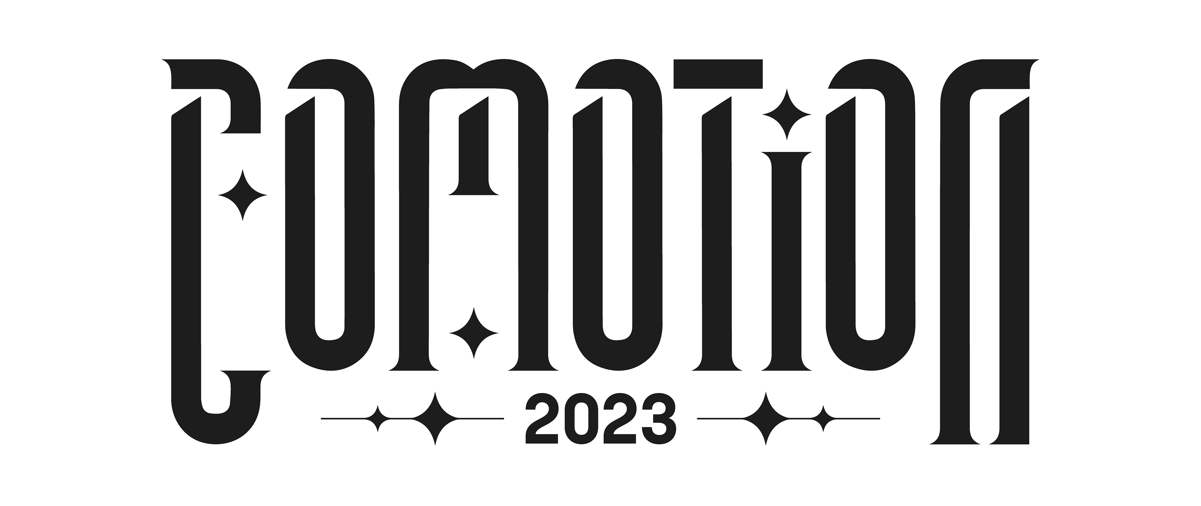
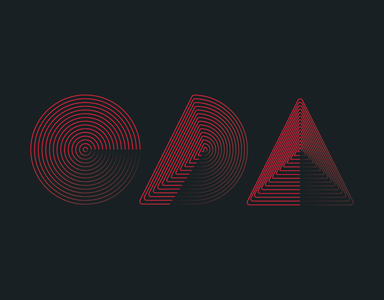
The logo is inspired by traditional calligraphy and modernist cinematic title cards.
Aanvik and I worked together to create this logo from scratch. He started off by creating the base design of the logo and handed it off to me to make adjustments and ensure that the geometry was all logically sound.
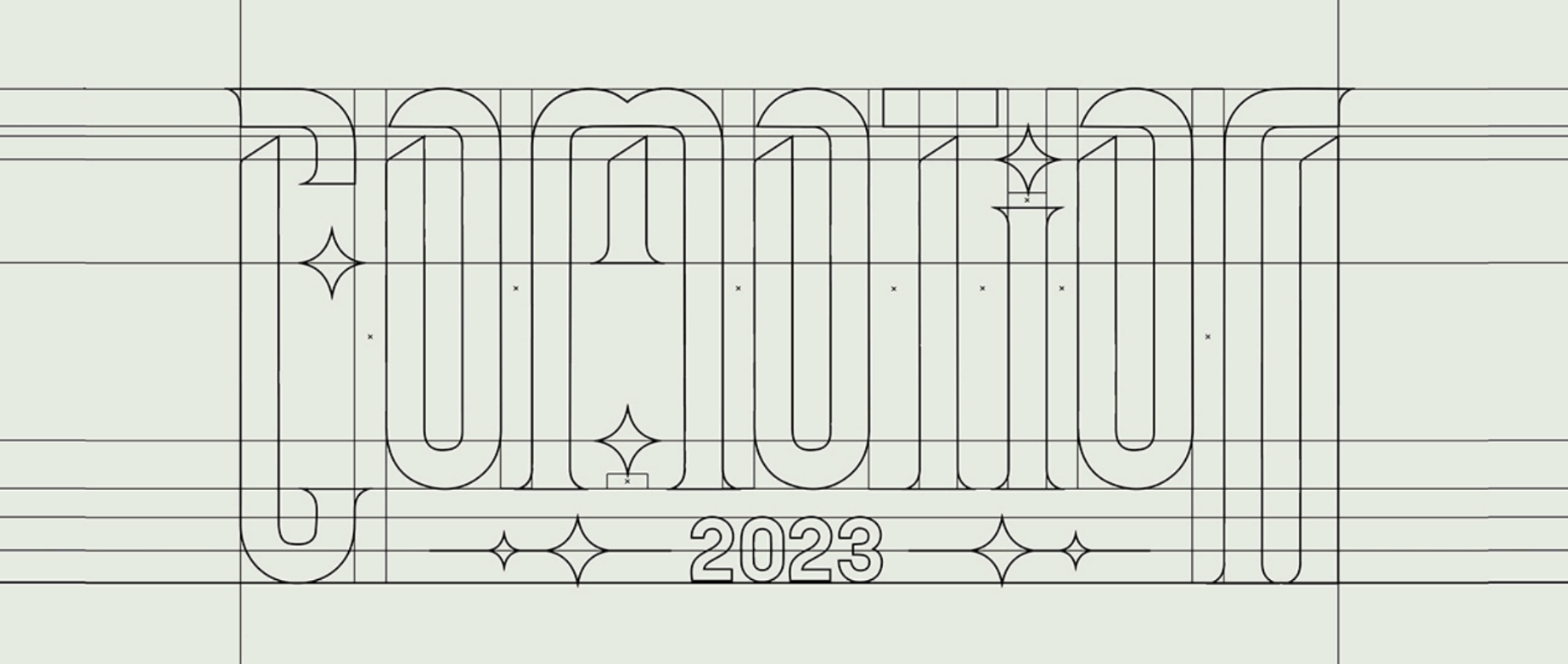
This logo breakdown shows all of the guides I created when cleaning it up in Adobe Illustrator. I wanted to make sure every aspect of the typography lined up with something, that there was consistent rhythm, and that the spacing that made sense.
our design system
From day zero, I collaborated with the directors and influenced the creative direction of the event by helping to create the design language that would serve as a guide for the production of the deliverables. I did this to ensure that my team would have the right amount of resources and direction when briefing them on what they needed to design.
Since this event is in-person, we needed to make sure that the branding would stay consistent from the screen assets to the print deliverables.
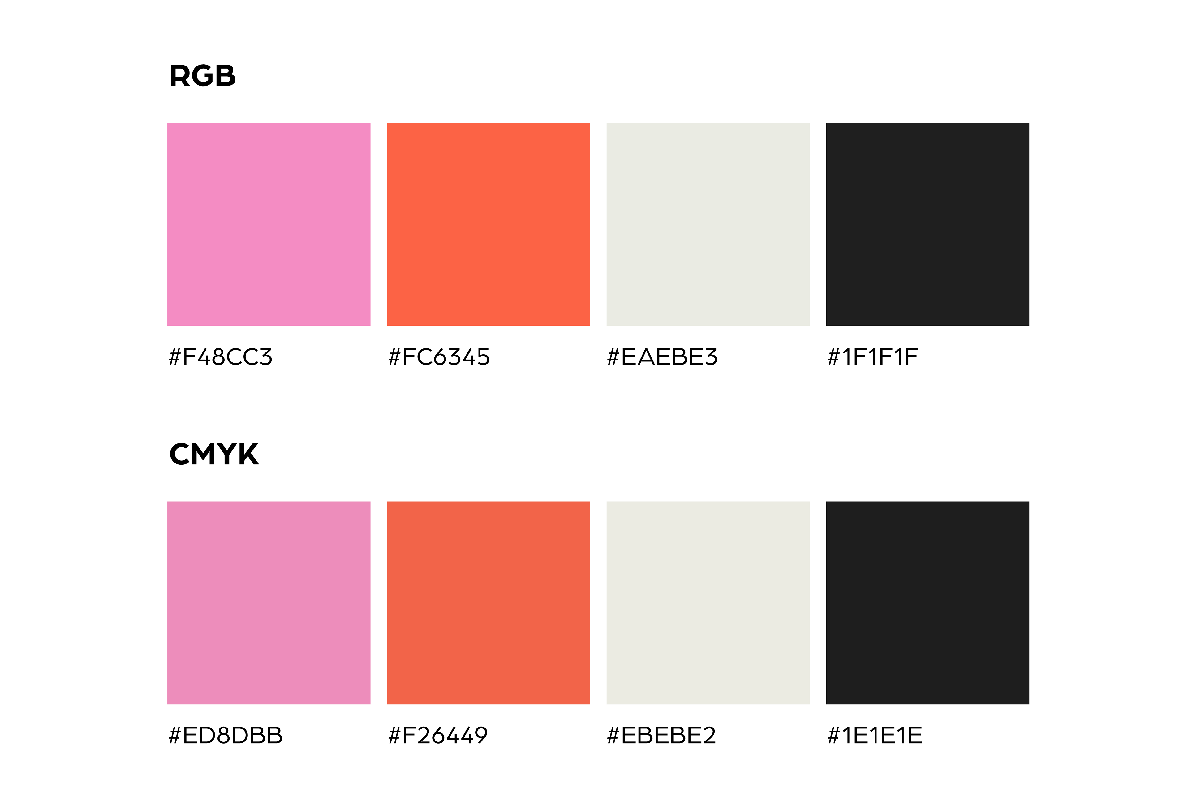
Using the established palette from the original pitch, I set up the colors for RGB and CMYK.
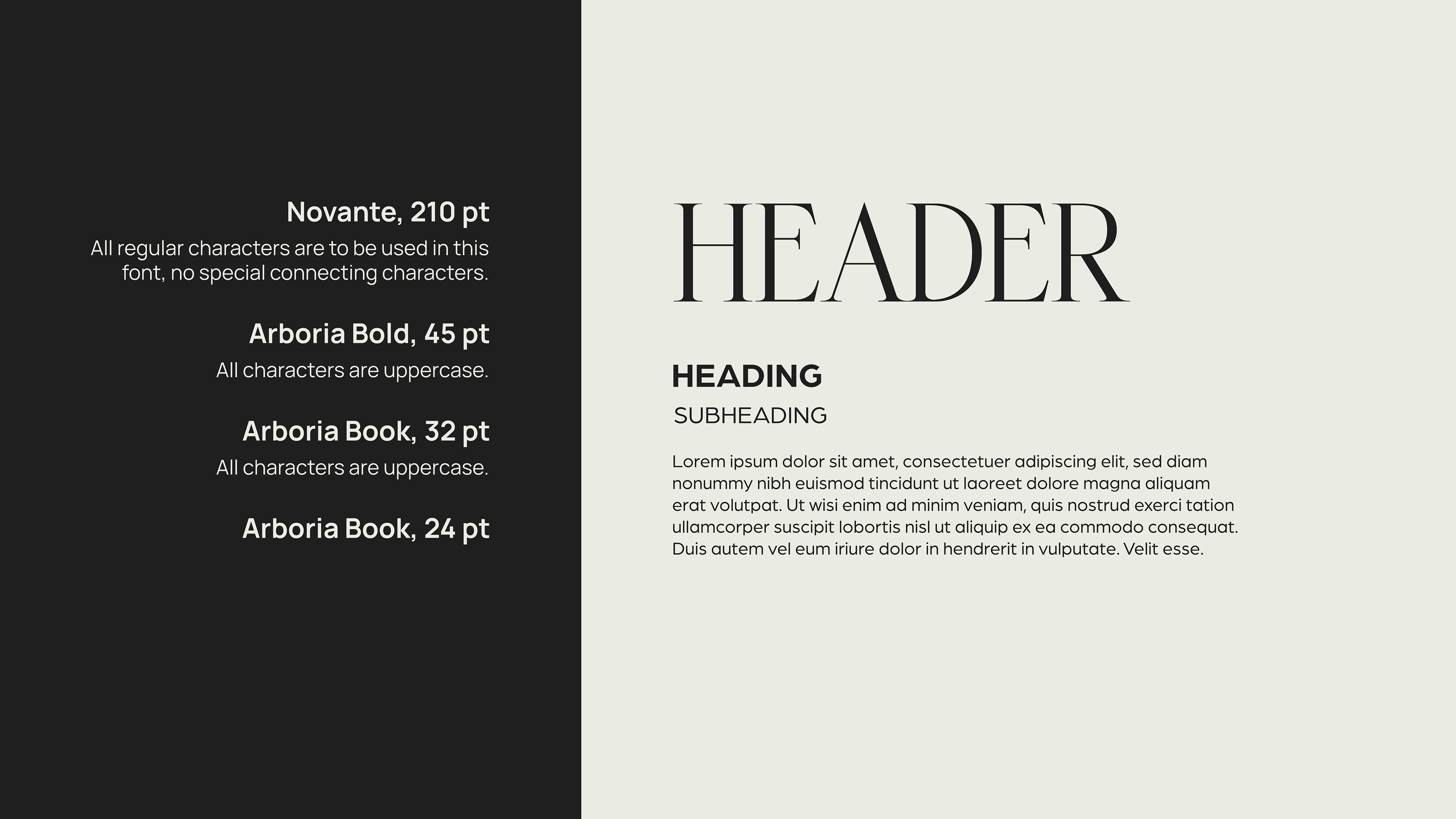
I also created a type study that established the font hierarchy. My team used it a lot for their reference, as well as the Web Team, Design Team, and Documentary Team.
The typography for the event primarily consists of multiple weights of Arboria, a sans-serif font. This is to balance out the highly decorative and elegant font, Novante.
Arboria is a legible and user-friendly way to represent the modern-day of design. Novante is a modern take on elegant, decorative fonts from the past. For our branding, we used it for the grandiose titles, like on the title cards to give it a modern twist on a classic film title card.

Aanvik, Marly, and I also developed a 5x3 grid system that was used across all of our deliverables. We also asked my team for conceptual input when formulating this. It informed the way we laid out text and assets in a way that made everything feel cohesive and structured.
The conceptual side of communicating our design system was that there were two worlds, the Micro World and Macro World. The Micro World was the abstract, more geometric parts of our design language. This was the primary language we used for our graphic design deliverables. The Macro World is the more photorealistic side of our design language. The only area of my department that this appeared in was one of the AR Postcards.
MY EXPERIENCE LEADING
I had never been in a leadership position before this so I was pretty nervous, but it ended up being a great experience and helped me discover new things to love about the design world. My favorite parts of it were helping out my teammates and facilitating an environment that had both accountability and structure, but also where people felt comfortable being themselves and speaking their opinions. It also helped that my team consisted of wonderful, kind, and hardworking people.
When leading meetings, I made sure that my teammates were clear on what they needed to get done by the next meeting by putting together meeting presentations that included design briefs, examples, assignments, and deadlines. We normally had designs to give feedback on so I would critique their designs along with the directors, Marly and Aanvik. I also communicated a meeting recap and any reminders in the Slack channel afterward to make sure that my members retained the most important bits of information and in case anybody couldn't be there.
Behind the scenes, I internally communicated with the directors to make sure I had the right creative directions for these meetings or to discuss any graphic design-related decisions that were about to be made.
Most of the deliverables were handed off to me to make any additional changes that were requested of me by the MOMELove presidents after the initial deadlines for my team members so they could move onto the next deadline.
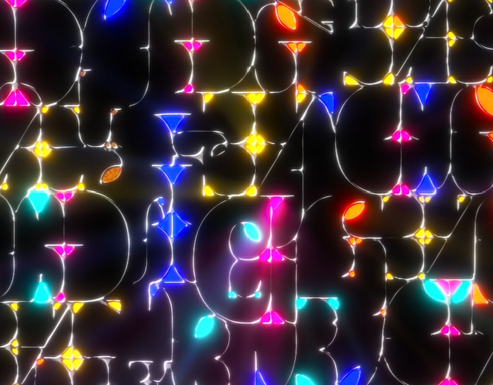
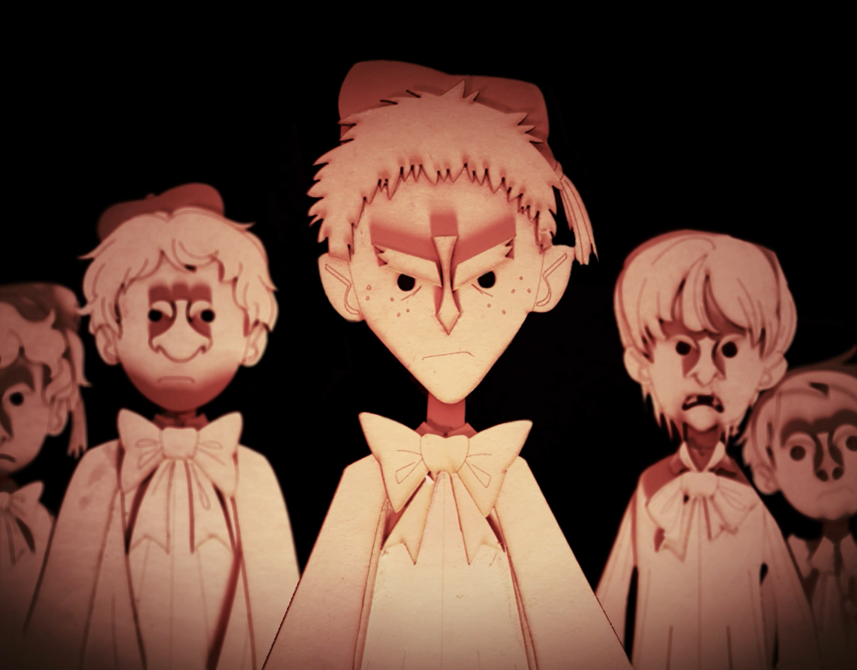
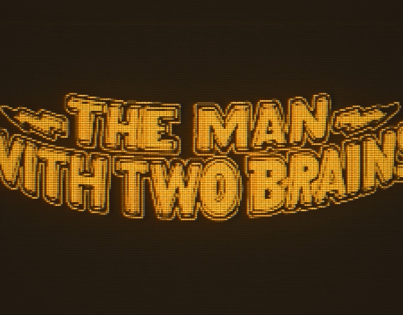
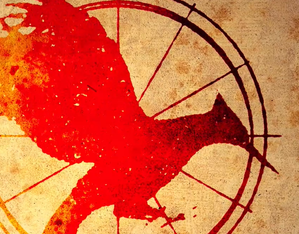
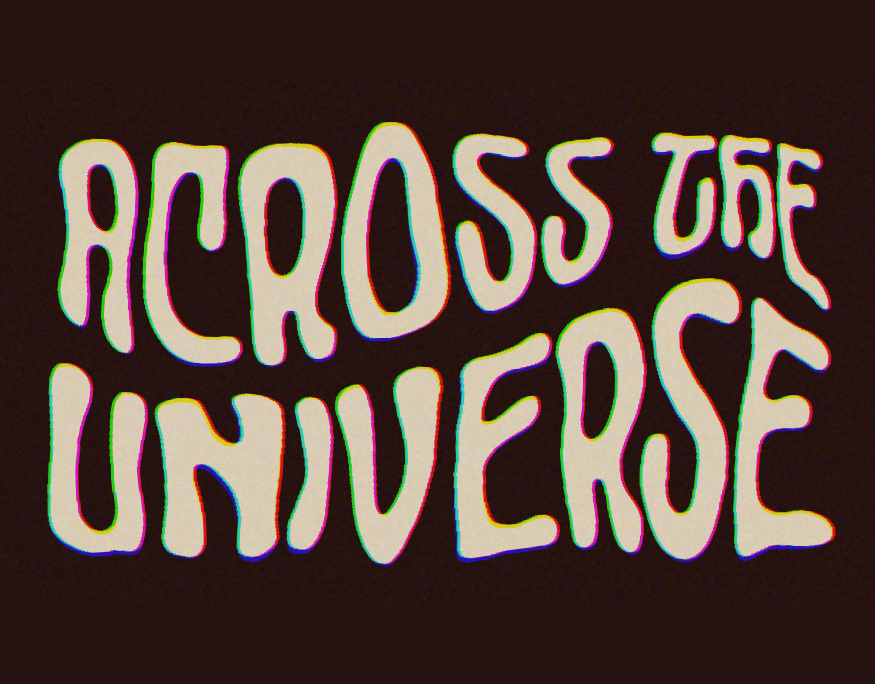
title cards
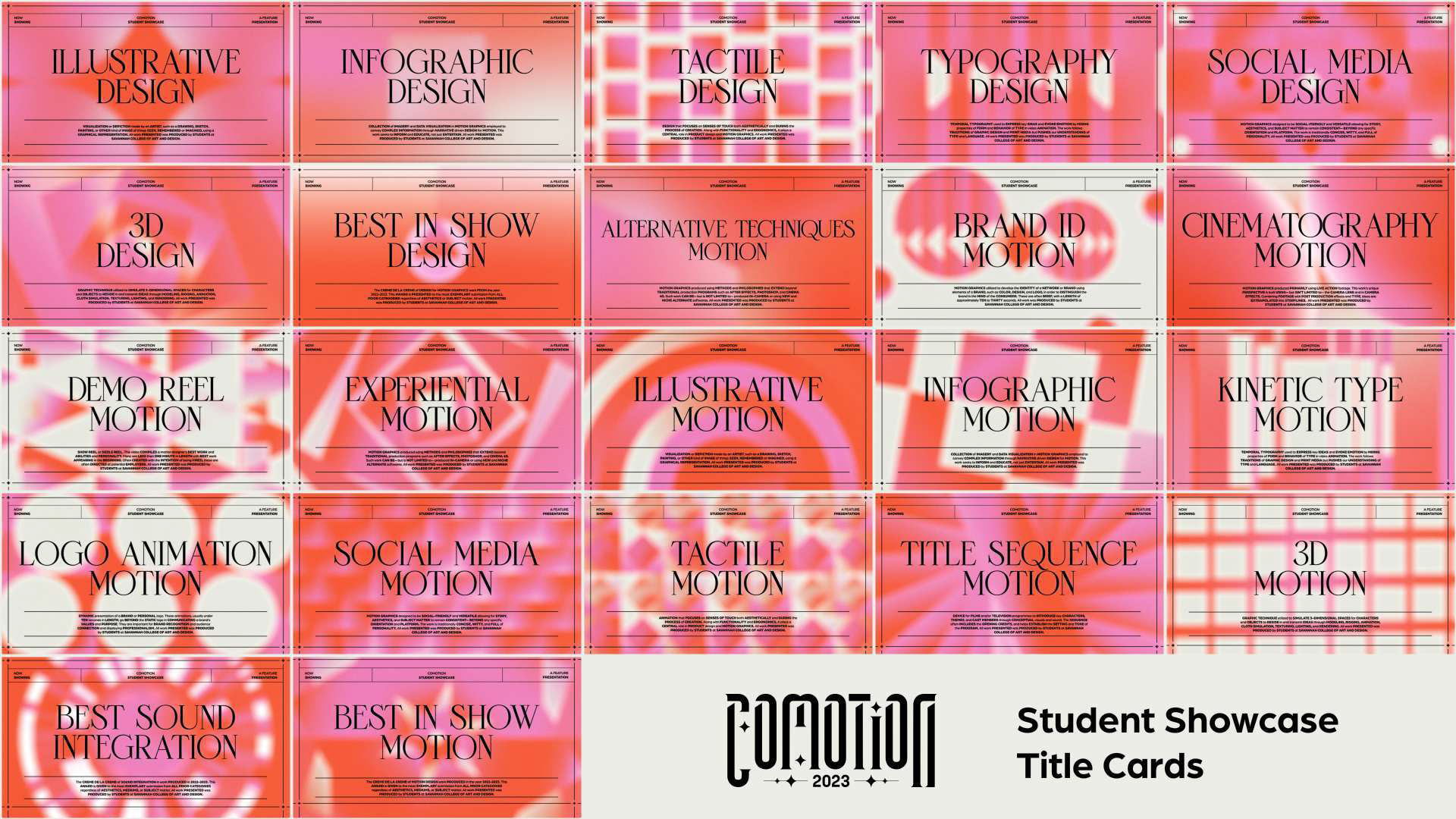
This was such an exciting deliverable to create with my team but also one of our biggest hurdles because of its scale. We needed to create title card styleframes for 22 categories at for CoMotion's main attraction, the Student Showcase. Each of my team members had to conceptualize and design 2-3 frames for motion. These styleframes were handed off to the Animation Team.
The biggest challenge of leading this deliverable was striking the balance of making my members feel like they had ownership and agency over their work but also staying consistent with the brand and each other while communicating the motion behaviors of light. Lucky for me, my team members were up to the task and handled the whole design process with grace.
The light motion behaviors that we wanted to communicate were reflection, refraction, and dispersion. These themes were a good base to give each title card direction in how they started and ended.
I also designed the main typographical end state of the title cards with Marly and Aanvik. It was a great opportunity for Novante to shine by being a modern twist on cinematic title cards of the past, as well as our grid structure.
In addition to the animated title cards, we also had to design still title cards for the Student Showcase and presentation transitions.
AR POSTCARDS
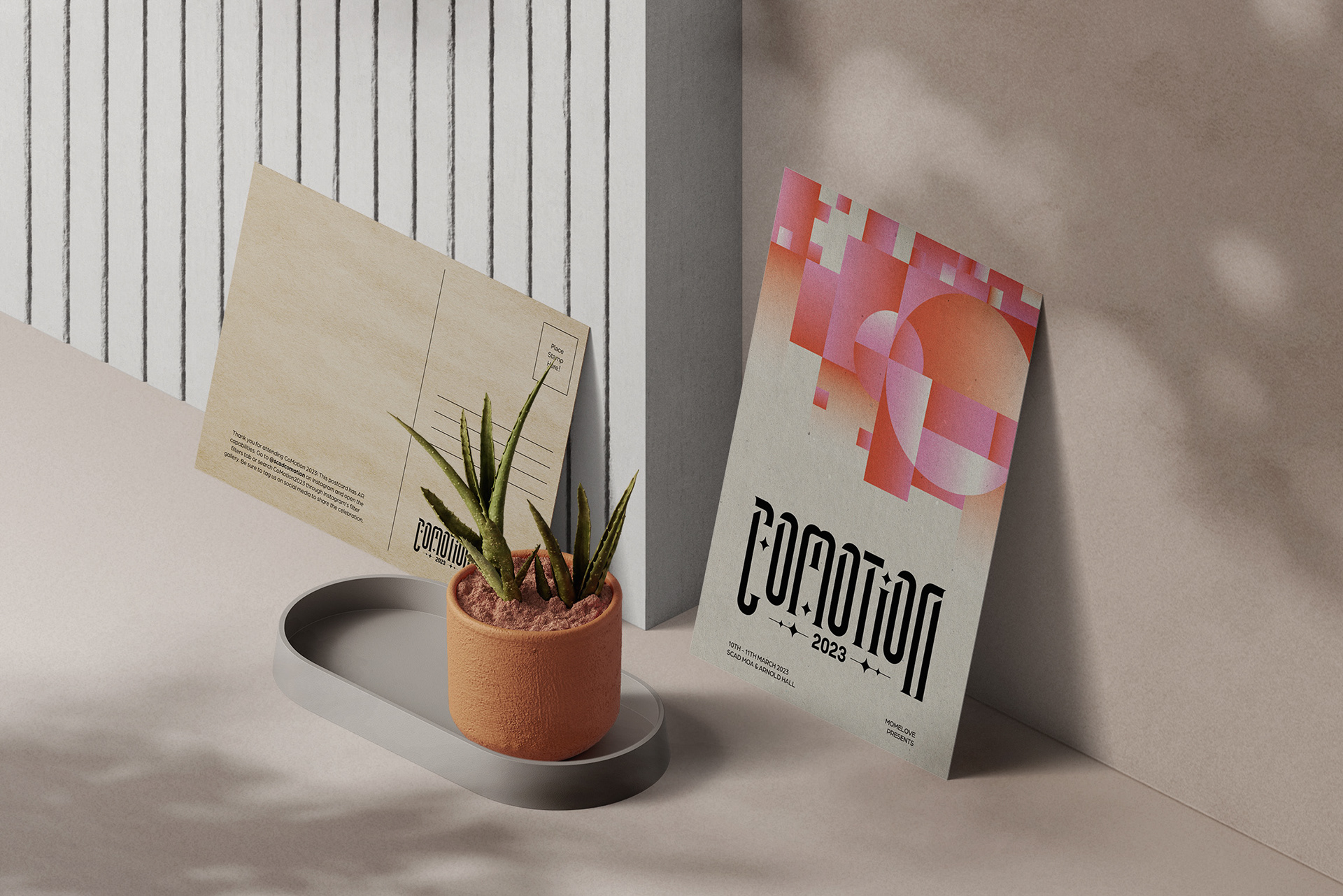
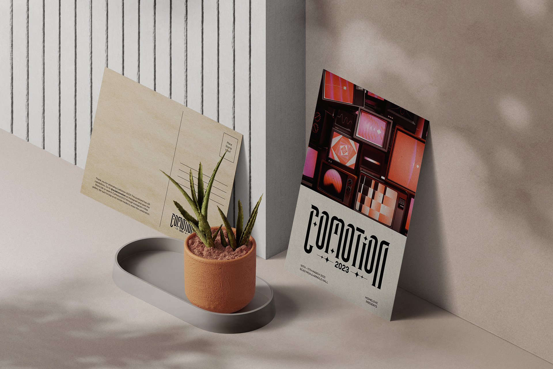
My team members, Punasa (Bee) Sihsobhan and Nicole Lin were in charge of designing the two AR Postcards. One postcard was in the Micro World style, and the other was in Macro World style. Both of them used the grid structure in how they communicated the visuals.
This project was a collaboration with the Experiential Team (Sam Woods and Juan Pablo Silhy), who brought these visuals to life via Spark AR, and J.C. Petrofsky, one of the 3D animators on the Animation Team who created the visuals for the Macro World postcards.
POSTERS
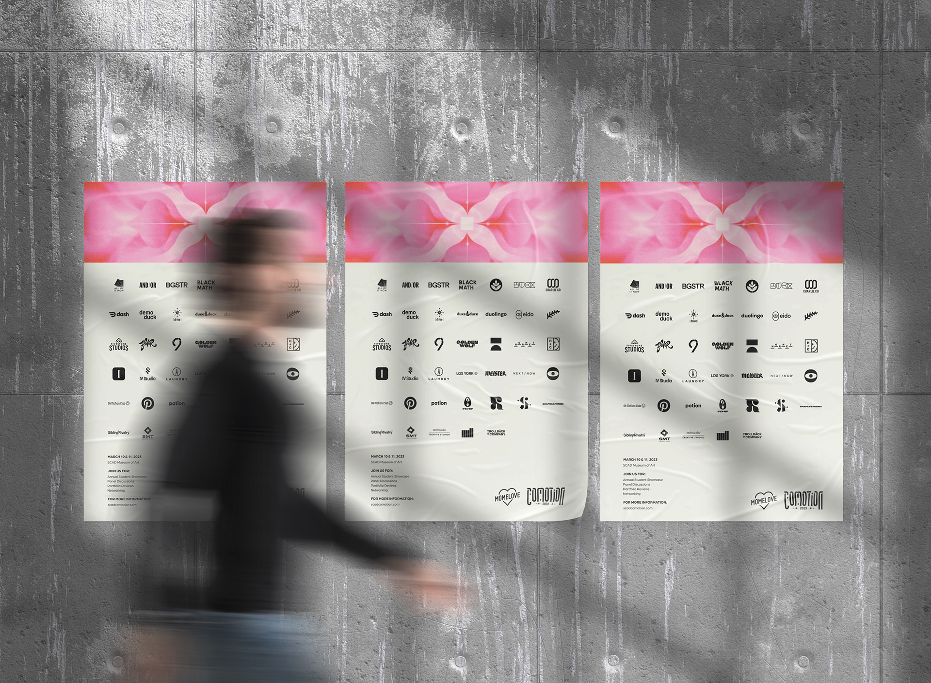
I was in charge of creating the posters to advertise CoMotion around campus and the large poster that will be displayed at the event. When formatting the logos, I created a system for myself to make sure that all of the different logos' scales would align with each other.
I gradient mapped Evian's styleframe from the title sequence to fit the CMYK color palette for print and so it had a more screen-printed vibe. Since we sparingly use gradients in printed materials in our design language, this felt like a good way of setting the styleframe from poster visual apart.
PRINT DELIVERABLES
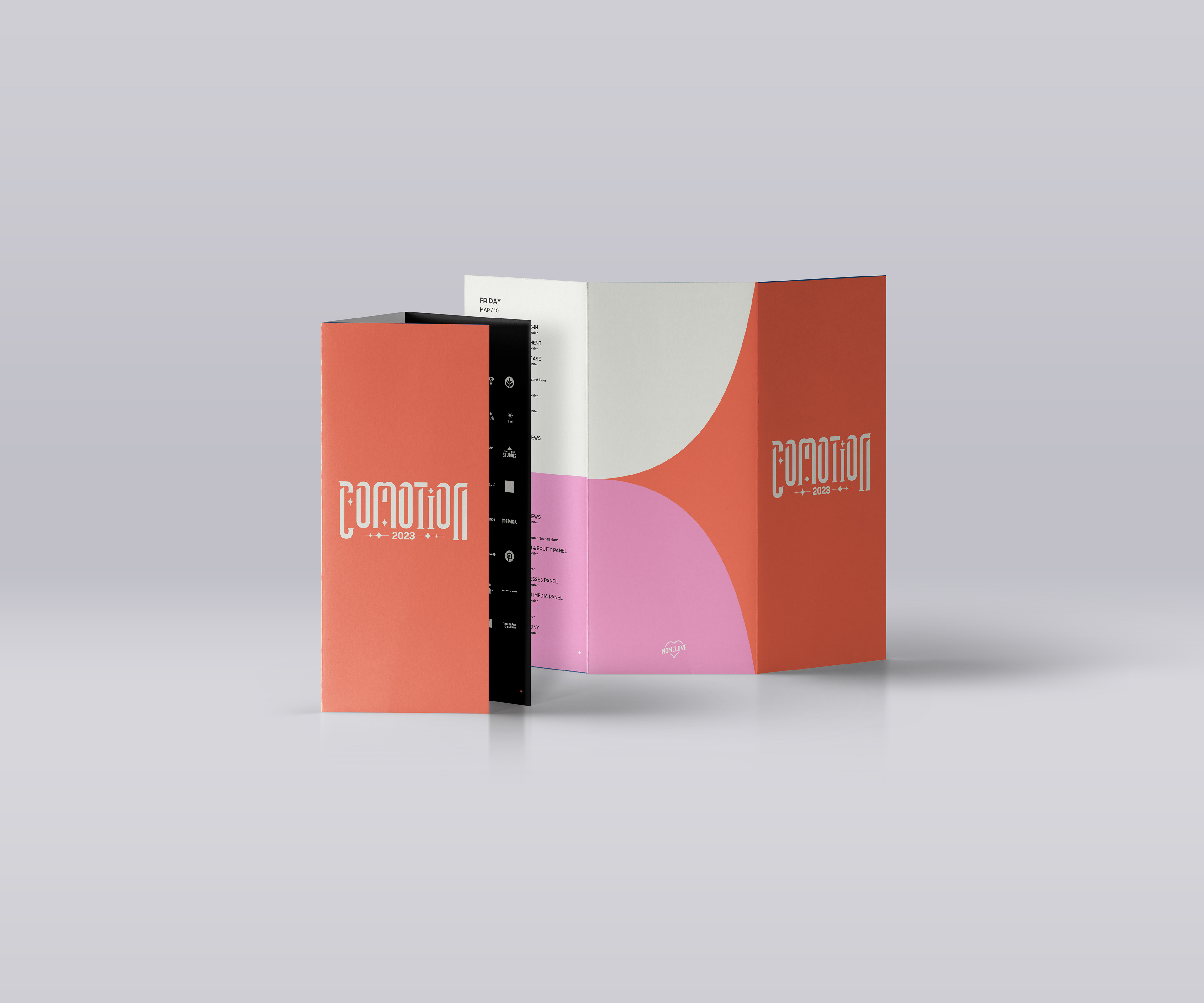
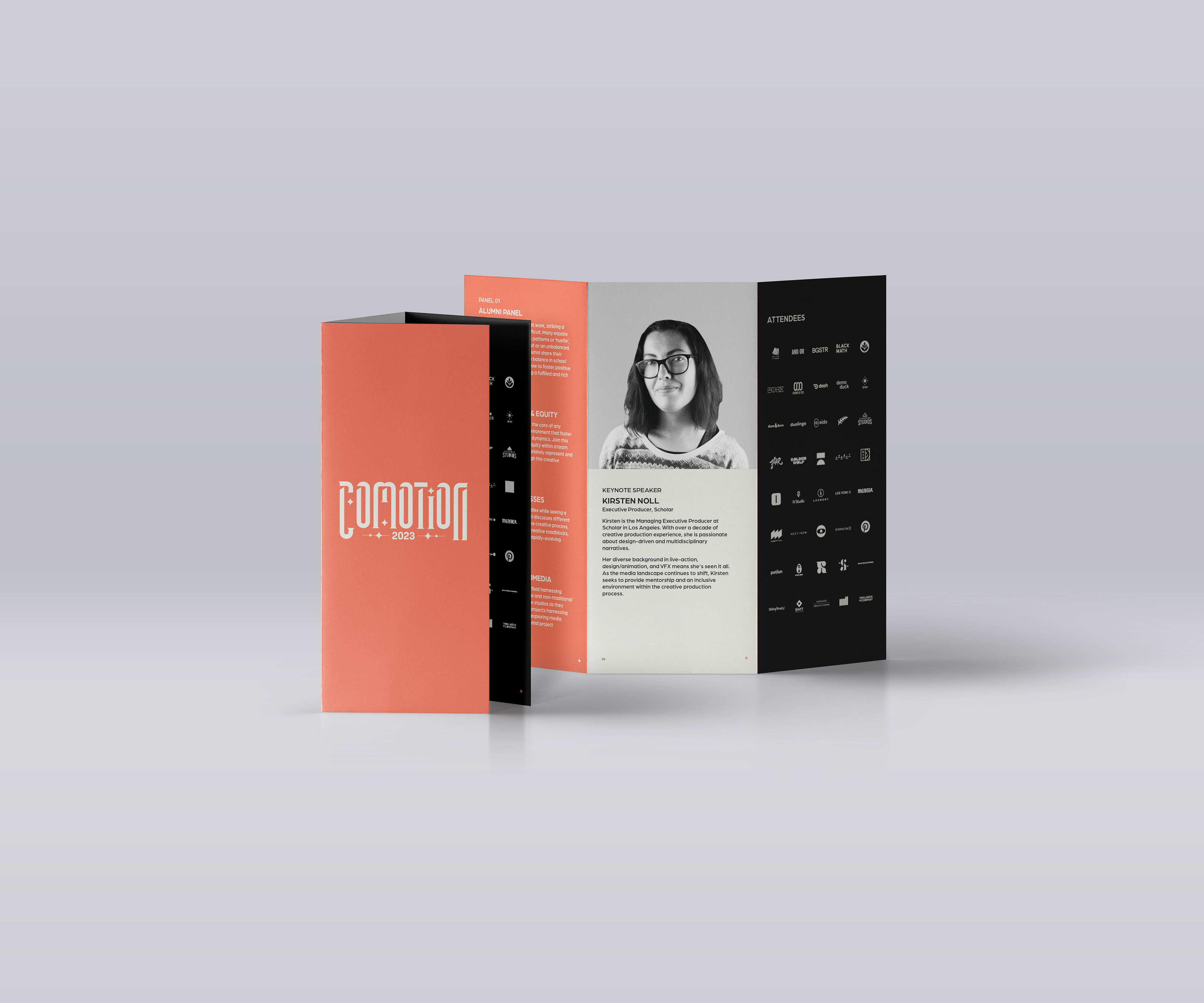
This part of the design process relied on a lot of conceptual abstraction because we wanted anything print to be simplistic, have no gradients, and be effective in communicating any content to event attendees, but also feel consistent with everything else. We had to adapt our grid structure and typography to a variety of different deliverables while being thoughtful about legibility and consistency.
Credits
Creative Director: Aanvik Singh
Art Director: Marly Koven
MOMELove:
Co-President: Cora Keene
Co-President: Alexandera Marca
Producers:
Alexis Dow
Rachel Golla
Graphic Design Team:
Graphic Design Lead: Josie Glassman
Meghna Shourie
Nicole Lin
Punasa Sihsobhon (Bee)
Sophia D'Alleva
Stephanie Sandoval
Claire Lin
Animation Team:
ANIMATION LEAD: Desmond Du
Cathy Lin
Erica Kim
Harshitha Suresh
Isabelle Kalyn Winarto
Kyle Samuel Switzer
Meg Aki
Design Team:
Design Lead: Tiffany Lo
Antara Ghosh
Jessica Liou
Xiyuan Wang
Tiffany Tedy
Peter Wang
Xinxun Liao
Yining Li
Experiential Team:
Experiential Design Lead: Samantha Wood
Juan Pablo Silhy
Alyssa Mackersie
Meghan Romance
Web Team:
Belle Duffner
Amadeus Cameron
Documentation Team:
Documentation Lead: Libby Nett
Caitlin Crooker
Savitri Trivedi
Sound Designer: Miguel Concha