Credits
Josie glassman - Logo Redesign, Filming, Color Grading, Type Treatment
Cora keene - Logo Animation, Filming, Props, Editing
lilian correa - sound fx
How do you create a title sequence that uniquely captures the essence of an already massively successful psychological thriller in a way that is both concise and artful?
YOU is a Netflix original show that follows Joe Goldberg, a book-loving antisocial serial killer who stalks and obsesses over a handful of different women during the course of the series. The show is told almost exclusively from his perspective and is all about putting the audience’s discretion and moral judgments into question.
The title sequence is focused on one of Joe’s overarching qualities, which is that he loves to fix things– one of those things being old books. We created a sequence depicting Joe repairing a damaged book with menacing overtones. Thematically, it parallels how Joe obsesses over and stalks damaged women, wanting to be their savior by infiltrating and ‘fixing’ their lives.
PROCESS
LOGO REDESIGN
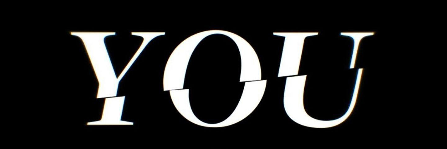
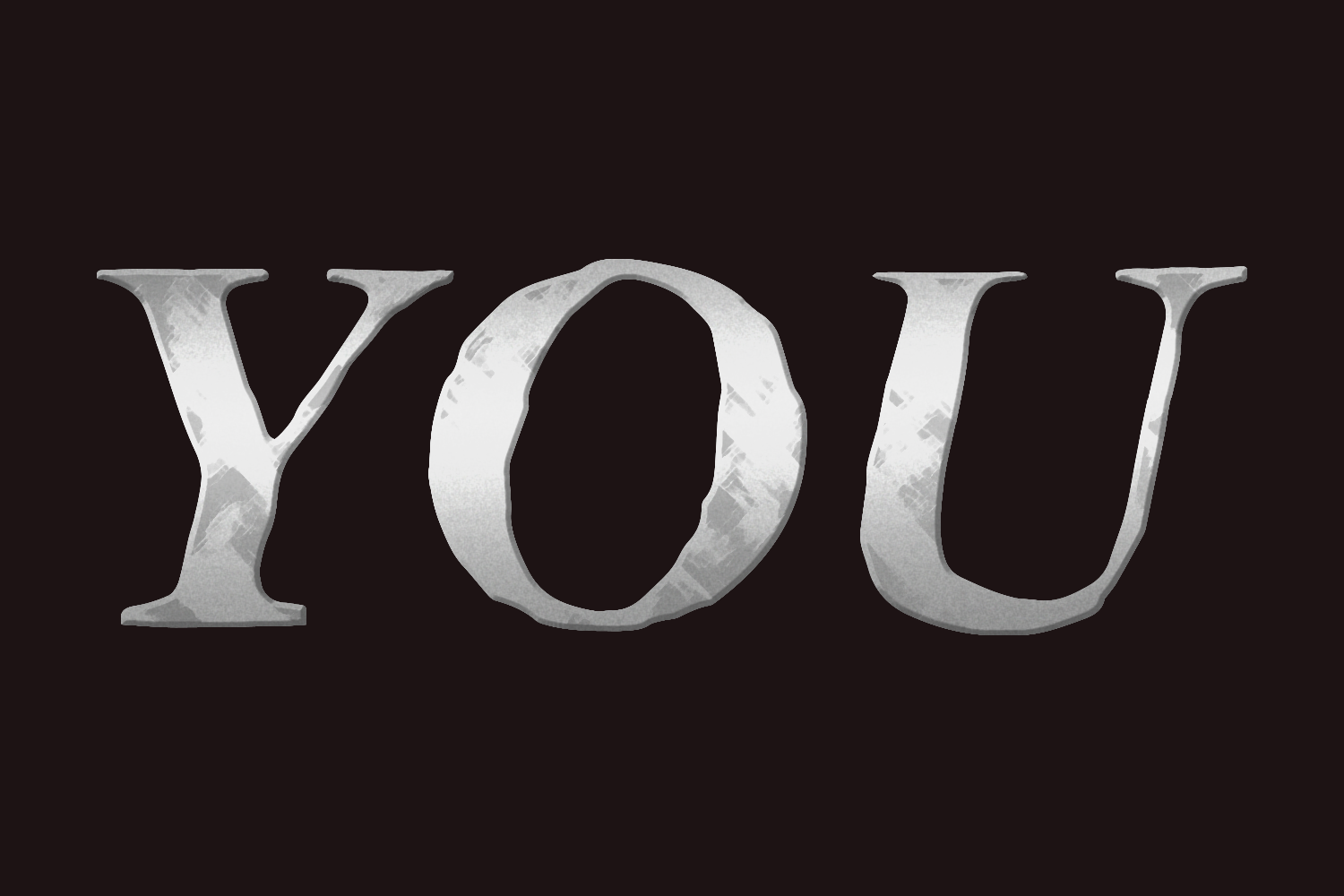
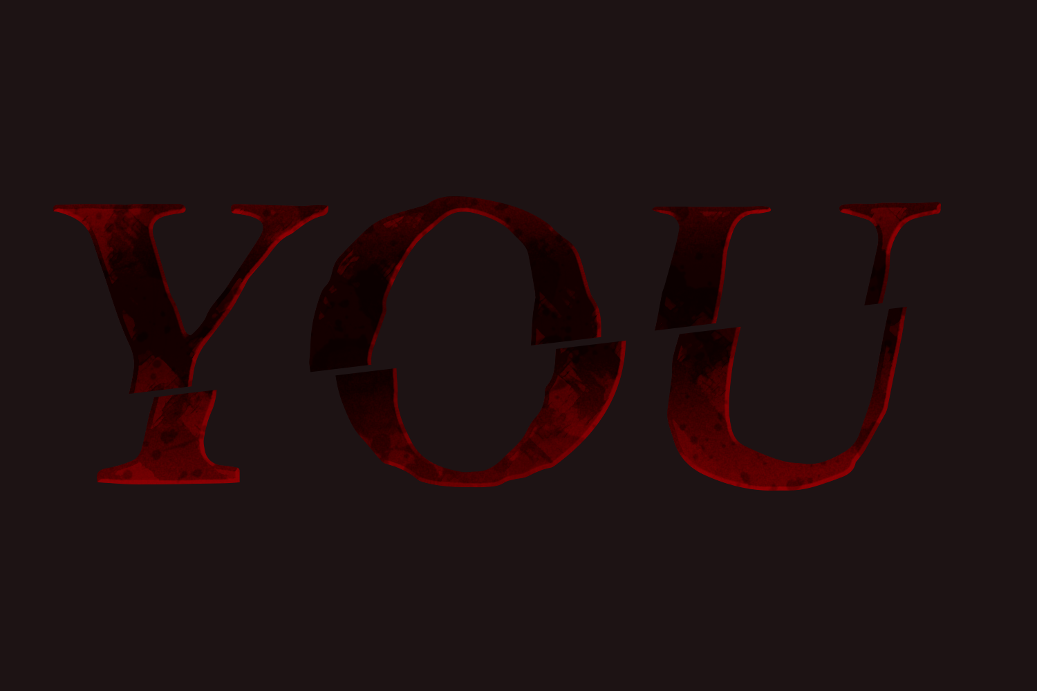
The logo redesign was focused on unifying the existing branding. There were two logos for YOU originally, the one for the title card and the one used in the promotional materials and Netflix banners. We decided to combine the best elements of each logo into one that we used as the sole logo. The animation is heavily based on the existing show logo because it was already a perfect fit for the show.

You Title Card Logo
You Netflix Logo
You Logo Redesign Silver
You Logo Redesign Slice Blood
FILMING
We filmed this in the school’s industrial building (because that was the only place we found with a table clamp). Filming took about 6 hours from start to finish, including setup. For props, we asked around (shoutout to our professor, Dominique Elliot, for providing multiple props), went to thrift stores, and looked on Amazon. Props used included an old book, razors, glue, scissors, a mallet, a brush, fake teeth, a needle and twine. About the fake teeth– those were made out of clay and hand painted!
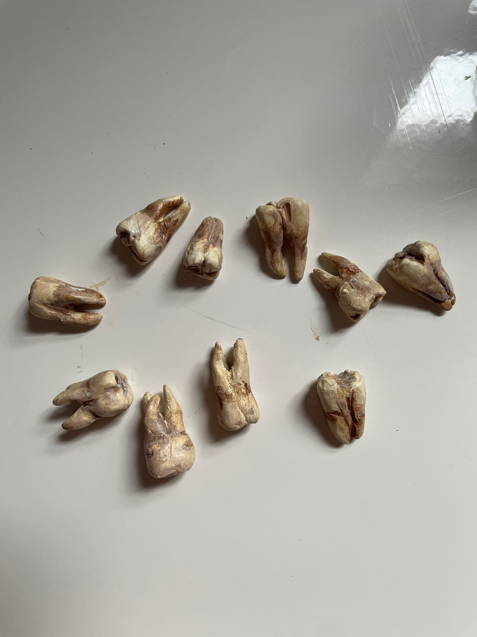
Painted Teeth
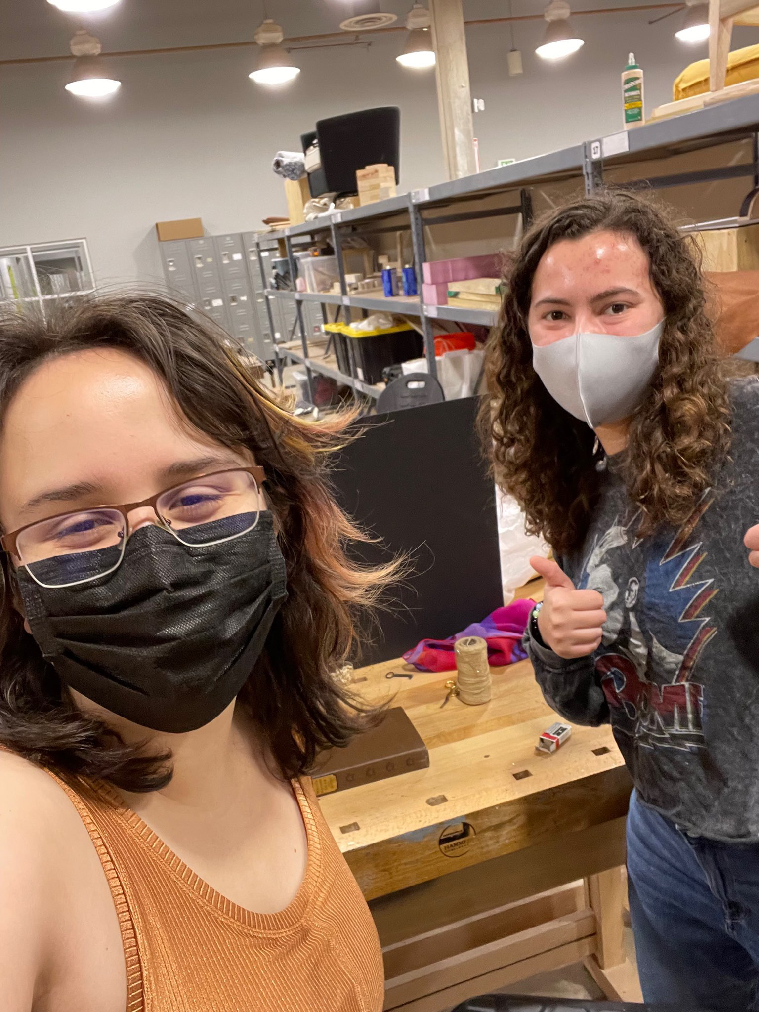
Me and Cora Filming!
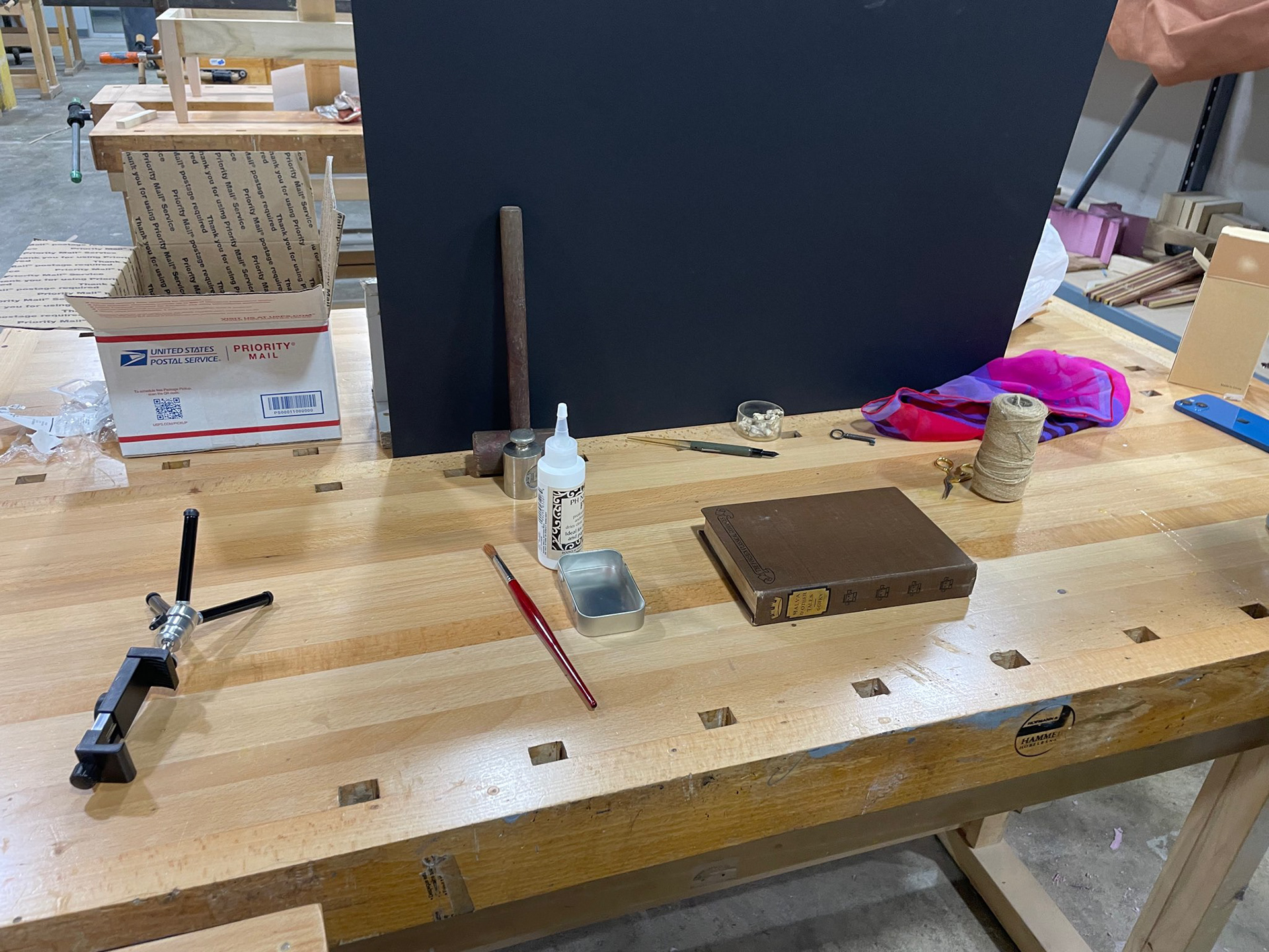
Our set and props
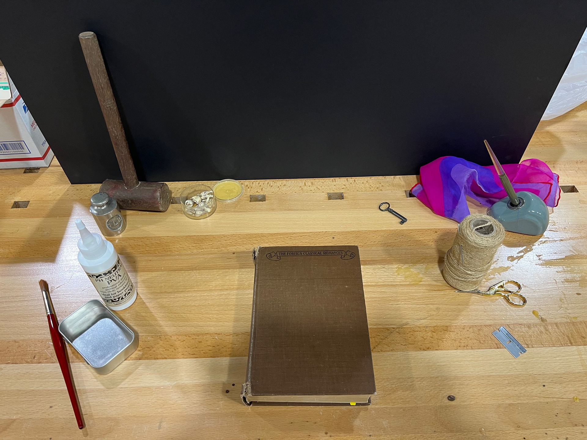
Initial composition
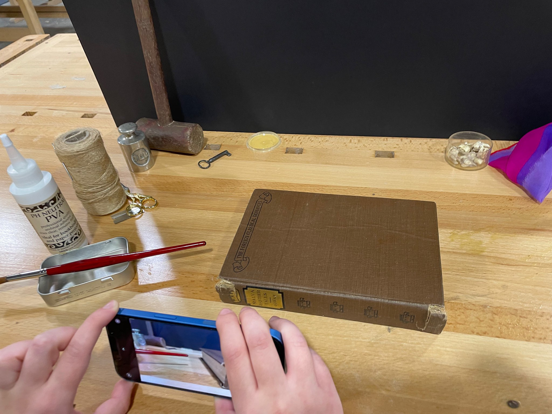
Filming the first shot
EDITING
This piece’s editing was all about adjusting the precise, slow motion shots and perfectly syncing action to the musical cues. The raw footage was slowed down using the plugin Twixtor, and edited using keyframes and time remapping. Certain shots were sped up to show quick, violent action, like the scissors cutting or the book cover ripping off.
The music selection was "I Only Have Eyes For You" by The Flamingos. It was chosen to highlight Joe's twisted perception of love because he believes that his screwed-up, stalkerish methods of getting the girl are romantic. The lyrics of this song now come off as creepy in the context of the show.
COLOR
The color grading for the title sequence is meant to be modeled after Joe’s basement in the show so that it looks cohesive, but with higher contrast and saturation to emphasize that sickly and menacing feeling.
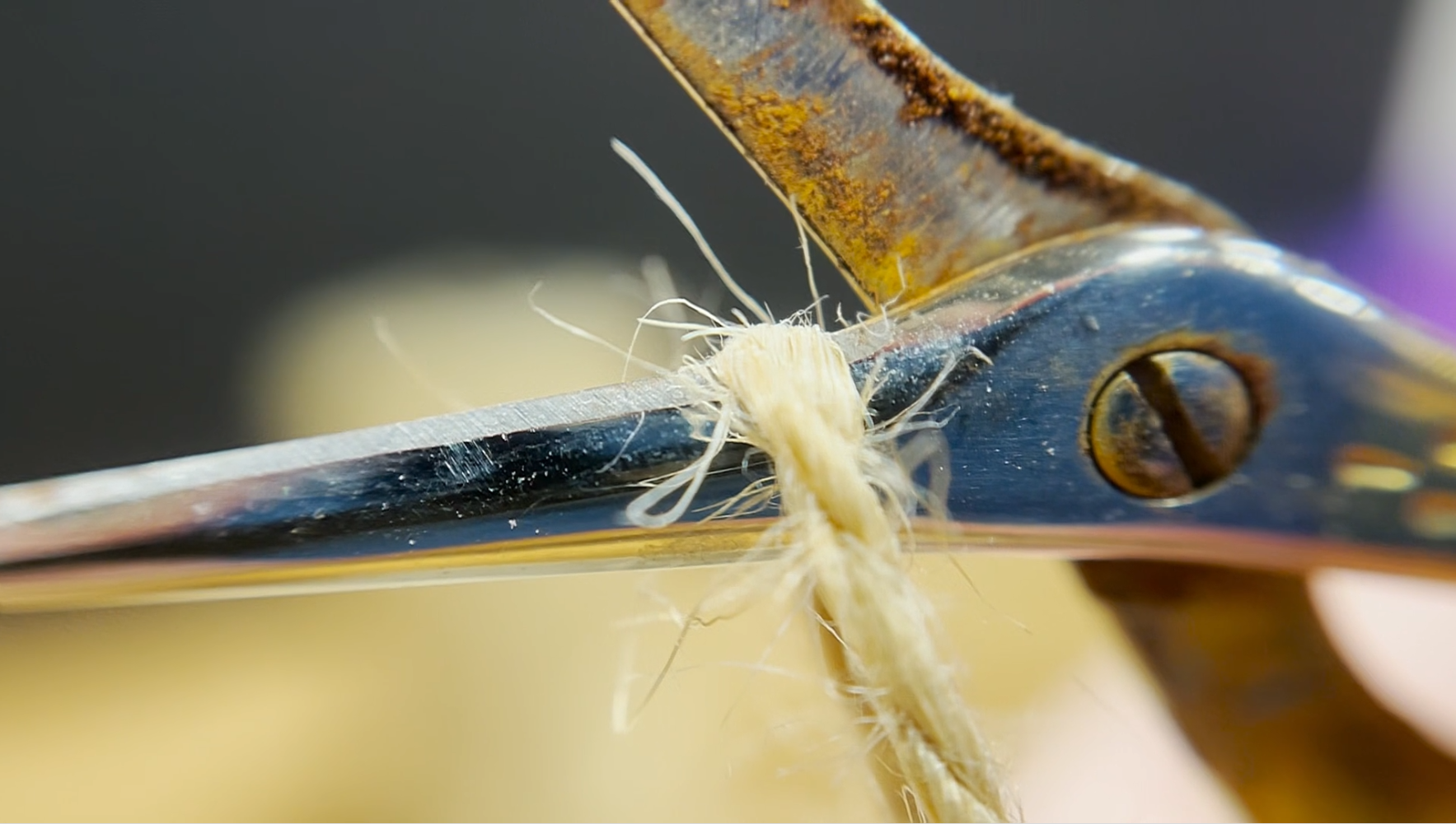
Raw Footage
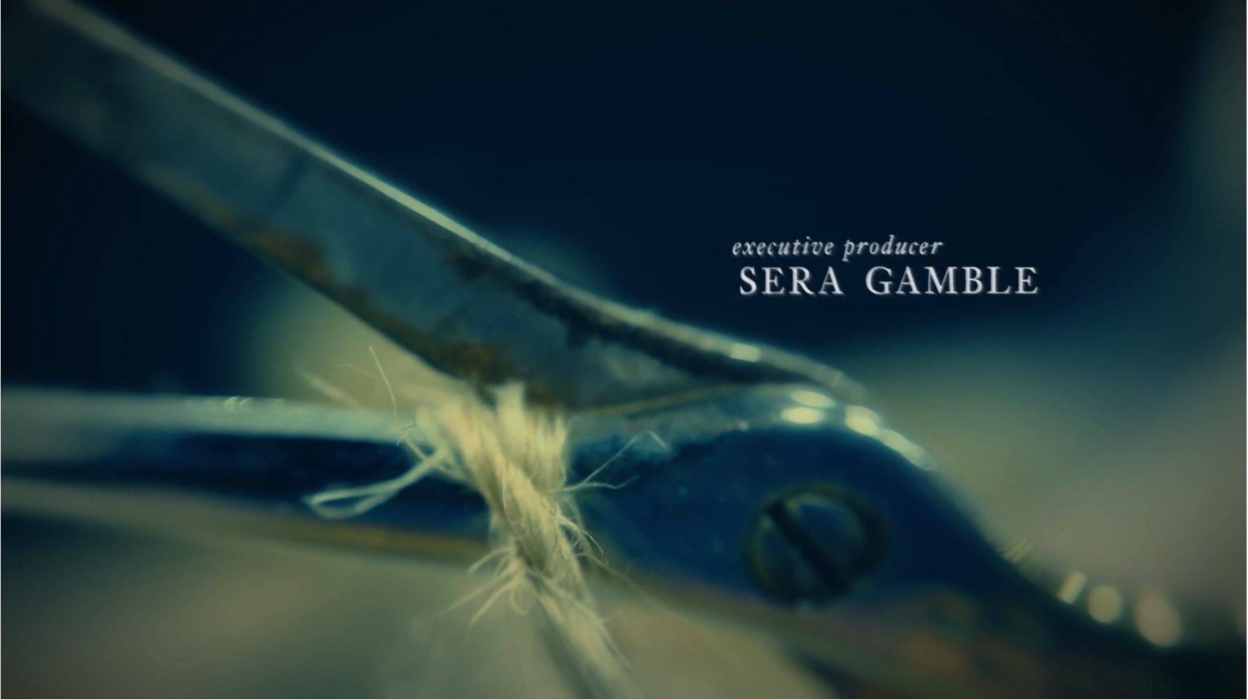
Color Graded
TYPE
The type treatment is a serif font to match the classic feeling of old books, which is integral to Joe as a character. The type gradually gets blurrier during the duration of each frame, emulating when someone smudges the ink of the text of a book.
BRANDING PACKAGE
Along with the title sequence, we created a branding package that includes a lower thirds, Netflix credit squeeze, social media ad, and animated billboard ad.

