Creative Director: David Perez
Motion/Graphic Designer: Josie Glassman
Video Producer: Noah Mitchell
Script Writer: Haley Kerpan
Project Manager: Brianna Kessler
THE ASK:
I was contracted by Ezio Creative to design and animate their self-run awards show featuring 75 jurors, the Online Design Awards. This awards show showcases talent from across all disciplines of art and design, nominating and awarding talent by students, professionals, and studios/agencies. This is the first awards show they are putting on, so we started from scratch in figuring out what the ODA brand could look like as a comprehensive motion system and how to implement that for the 103 nominees on a tight deadline.
The Solution:
I developed an overarching concept of the design theme for the awards show and color palettes Ezio Creative had already chosen. Then, I worked with several levels of automation while designing and animating the templates to populate the data efficiently.
how:
Concept Development
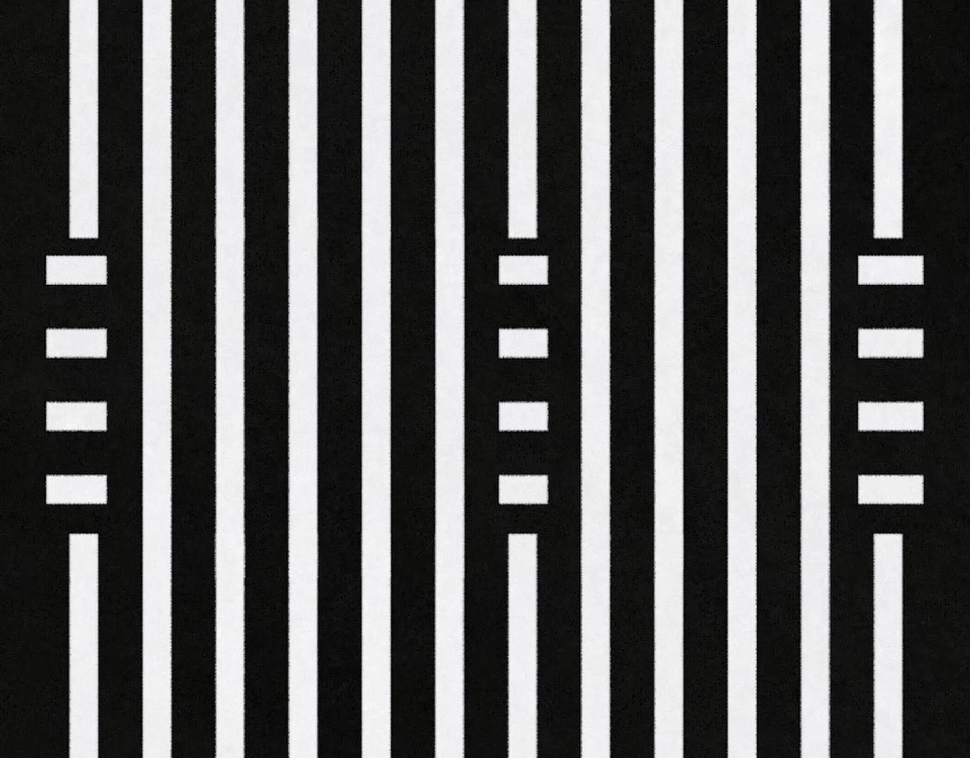
After being brought on to this project and taking a look at what already existed from the ODA brand, I noticed that a defining quality of the branding relied on lines. They felt like a core element of the brand, so for this year’s Annual Awards Show, I decided that the emphasis should be on lines.
One of the most important challenges I had to solve was figuring out how to express each category in a way where they felt distinguished from each other but also part of the same system. We determined that we should use the accent colors of the ODA palette to define each category, and I felt that there should be another motion element that gives each category title card a little something extra and special.
I started by researching how lines are used in a way that felt on-brand but also pushed the concept further, and landed on asking this question: How are lines used creatively? In the case of ODA, lines were being used both in a structural way to organize the elements of the compositions and decoratively to give the composition flair and personality. This felt like two schools of thought, logical and artistic, which also reminded me of Left Brain and Right Brain ways of thinking. Then I realized that is what ODA stands for, a celebration of all types of creative thinking.
I developed this scale of Left Brain and Right Brain ways of creative thinking and placed each category on the scale to make it easier to figure out how to express this concept visually.
Left Brain: The lines have more structure and logic to them
Right Brain: The lines are unrestrained and expressive
The further left or right the category is, the more the lines will adapt to those traits.
deliverables
When I was asked on this project, we had a small team of 4, 103 nominees, 17 winners, and a full live-streamed show to complete in less than 2 months. How can we make this feasible for us to do while also setting a high standard for future award shows? My answer: automation.
Using After Effects, Google Sheets, and Templater, I developed a full motion system of templates that could render out all of the nominee names and clips in bulk while also making each nominee/winner presentation dynamic and fun. I created a folder system where my team could put all of the clips and a Google Sheet system where they could populate each sheet with the data for the nominees, winners, and file paths for the clips. In After Effects, I utilized Templater to designate where each piece of data will go when it is rendered out.
Shoutout to Haley for creating each nominee clip and adding it to the spreadsheet, and David for going through each automation result to make sure everything rendered out correctly! That was over 100 nominees + winners to go through and it helped me out so much.
DESIGN PROCESS
Based on my conceptual research, I decided I needed to look at how I design and animate the motion system in layers.
Left Brain Layer: The lines are used in a structural, logical way to display the informational elements, such as the text and clips, in a dynamic way.
Right Brain Layer: The lines are used in an animated, expressive way to showcase the theme of this year’s Awards Show
left brain layer
right brain layer
ODA likes to use 3d elements in its branding as well, so to express that using this year’s theme, I put all of the elements within 3d space in After Effects. This opened up opportunities to show how much dimension this simplistic-looking theme had with more exciting motion like dynamic camera movements to establish the flow and sequence of events, which gave more opportunities for the Right Brain Layer to shine.
For the Right Brain Layer, I decided to utilize the Creative Thinking scale I developed to guide me on how I should design and animate the lines. I landed on using shape blends because it gave an interesting three-dimensionality that felt on-brand without having to touch 3d software. One of the keys to having control over shape blends is the blend’s Spine, which is a shape that determines how the blend is structured. I created a spine shape system based on the Creative Thinking scale to help me know how to design each category.
Broken down, it’s a morph from a square to a line to a circle, shapes that I feel best represent the balance between the Left and Right Brain. The result wound up being exactly as I hoped, with the Technology category having more structure and logic and the Art category being more freeform and expressive.

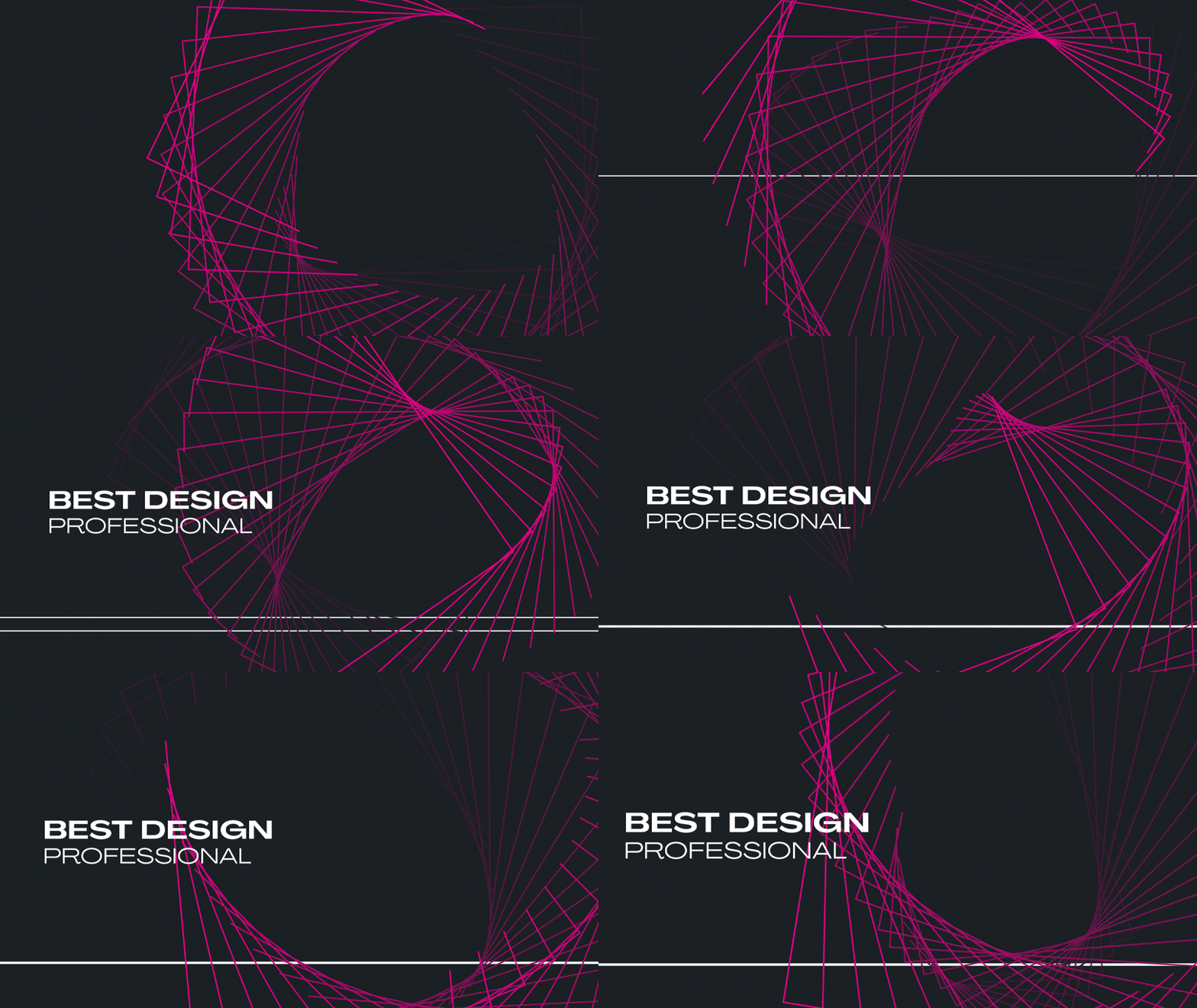

The other motion elements I created for the Awards Show are the logo animation and the lower thirds for the in-between segments of the show. This included a segment featuring me talking about my design process for the show.
PRINT DELIVERABLES
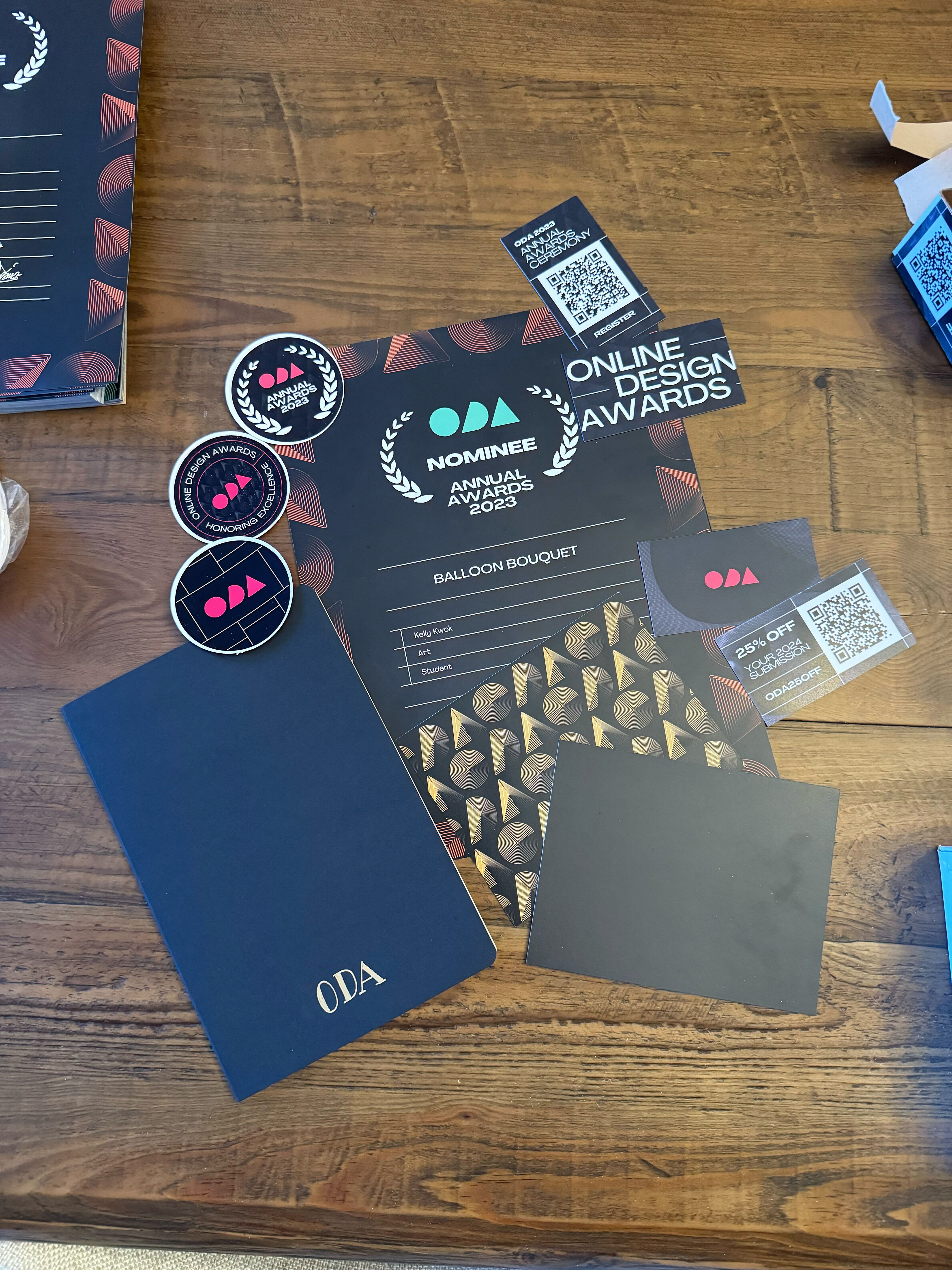
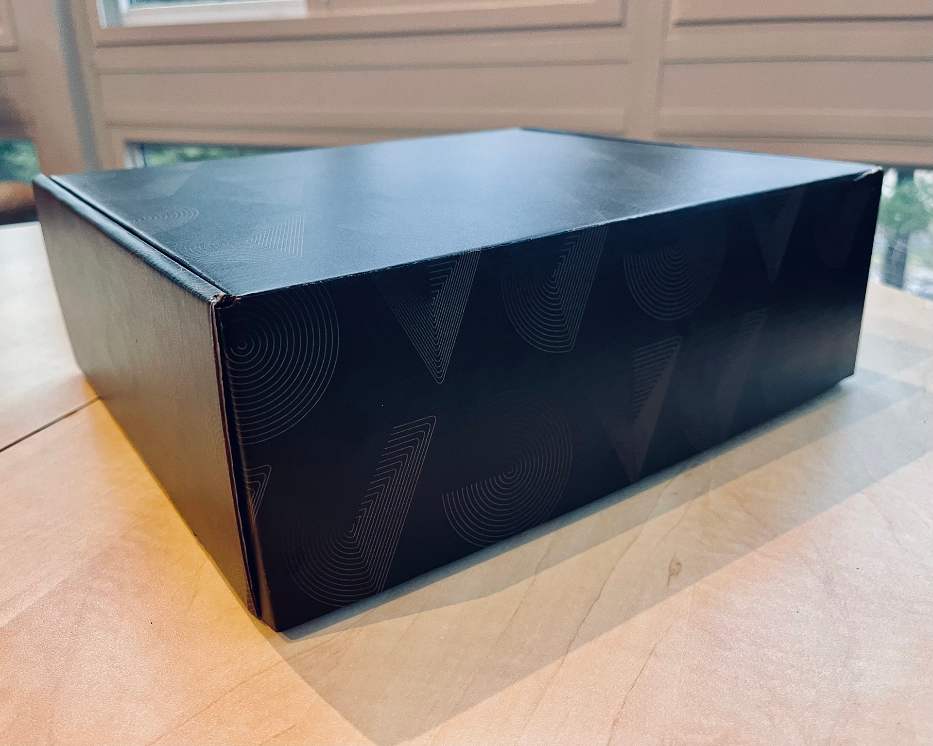
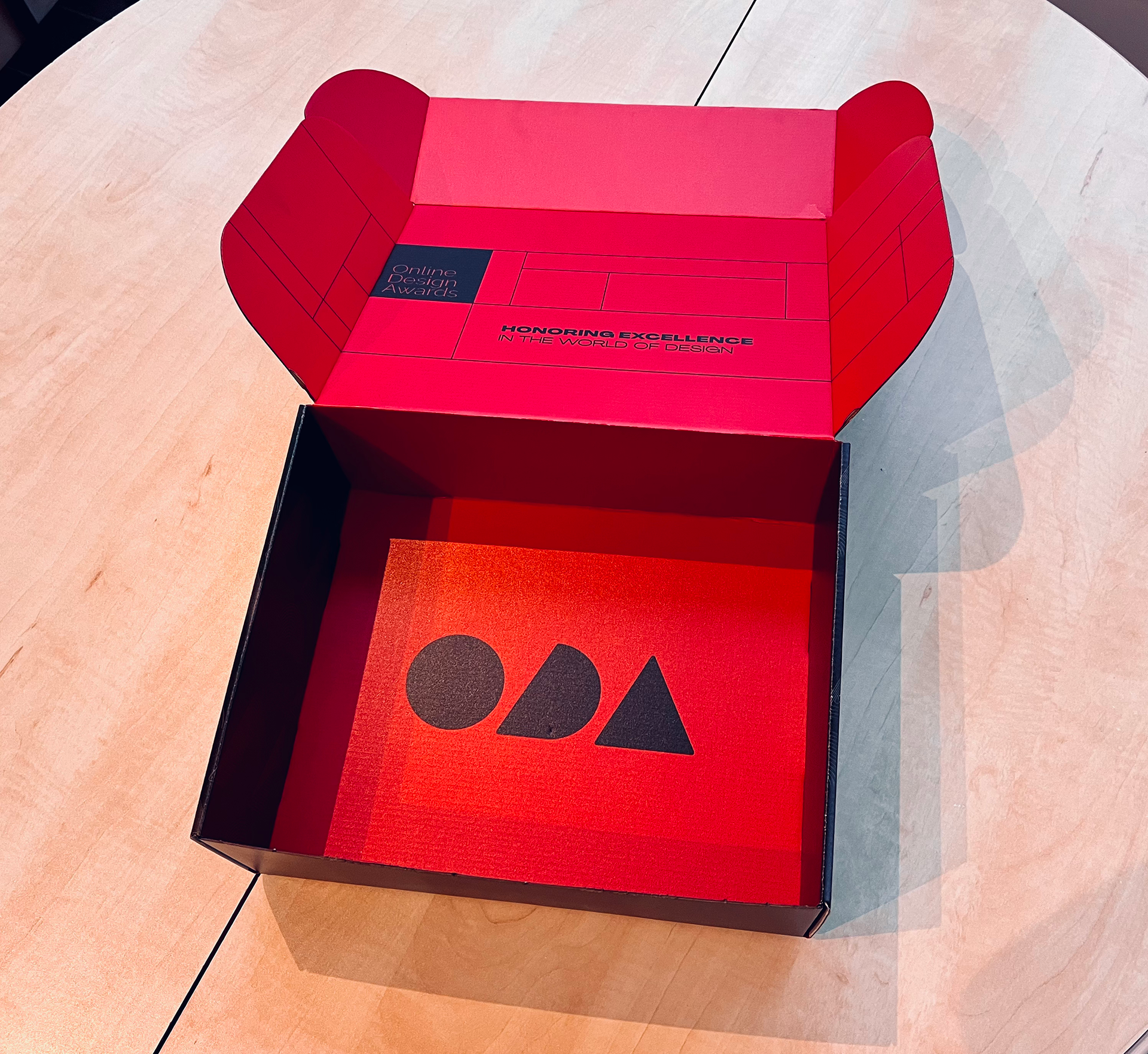
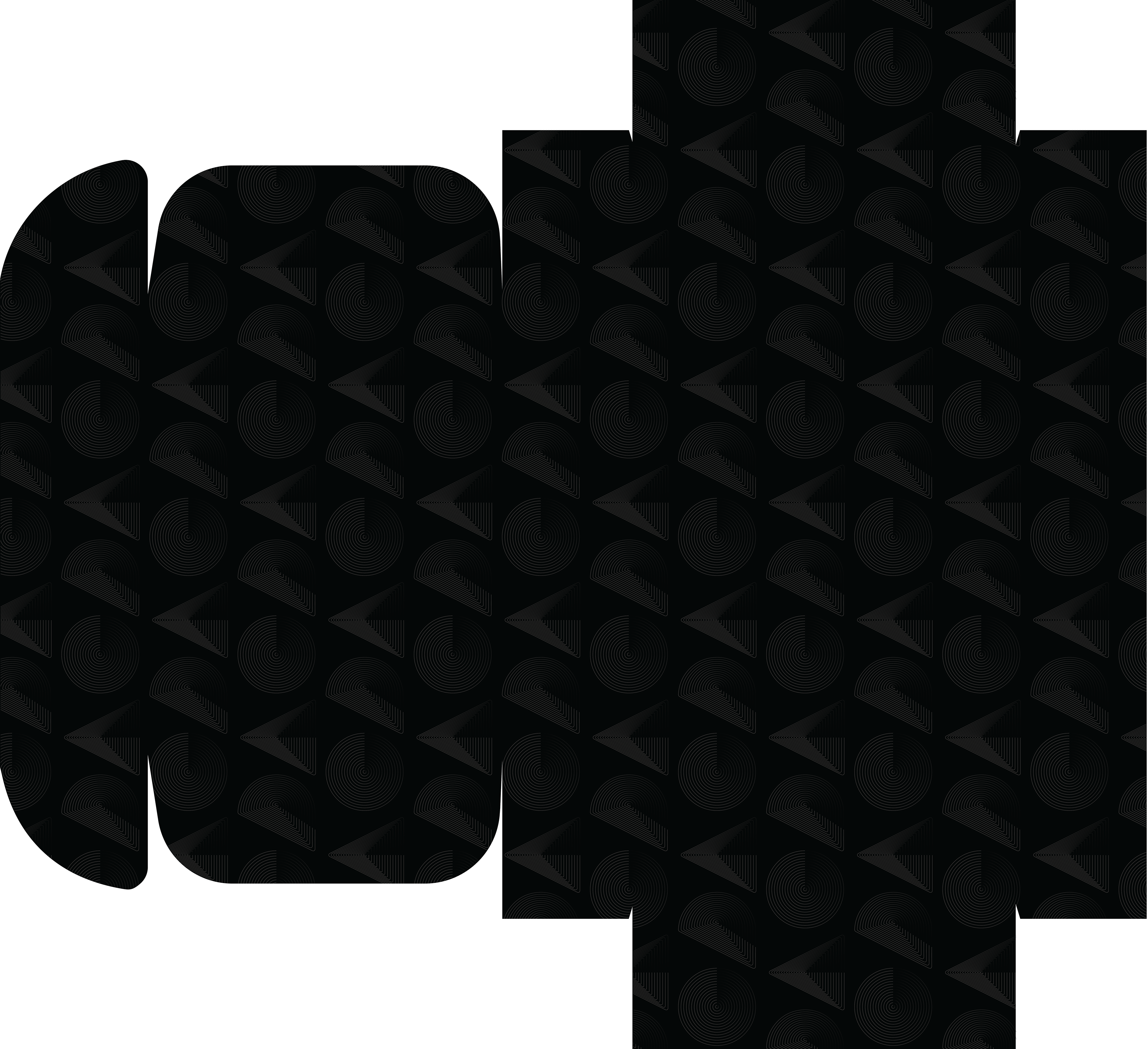
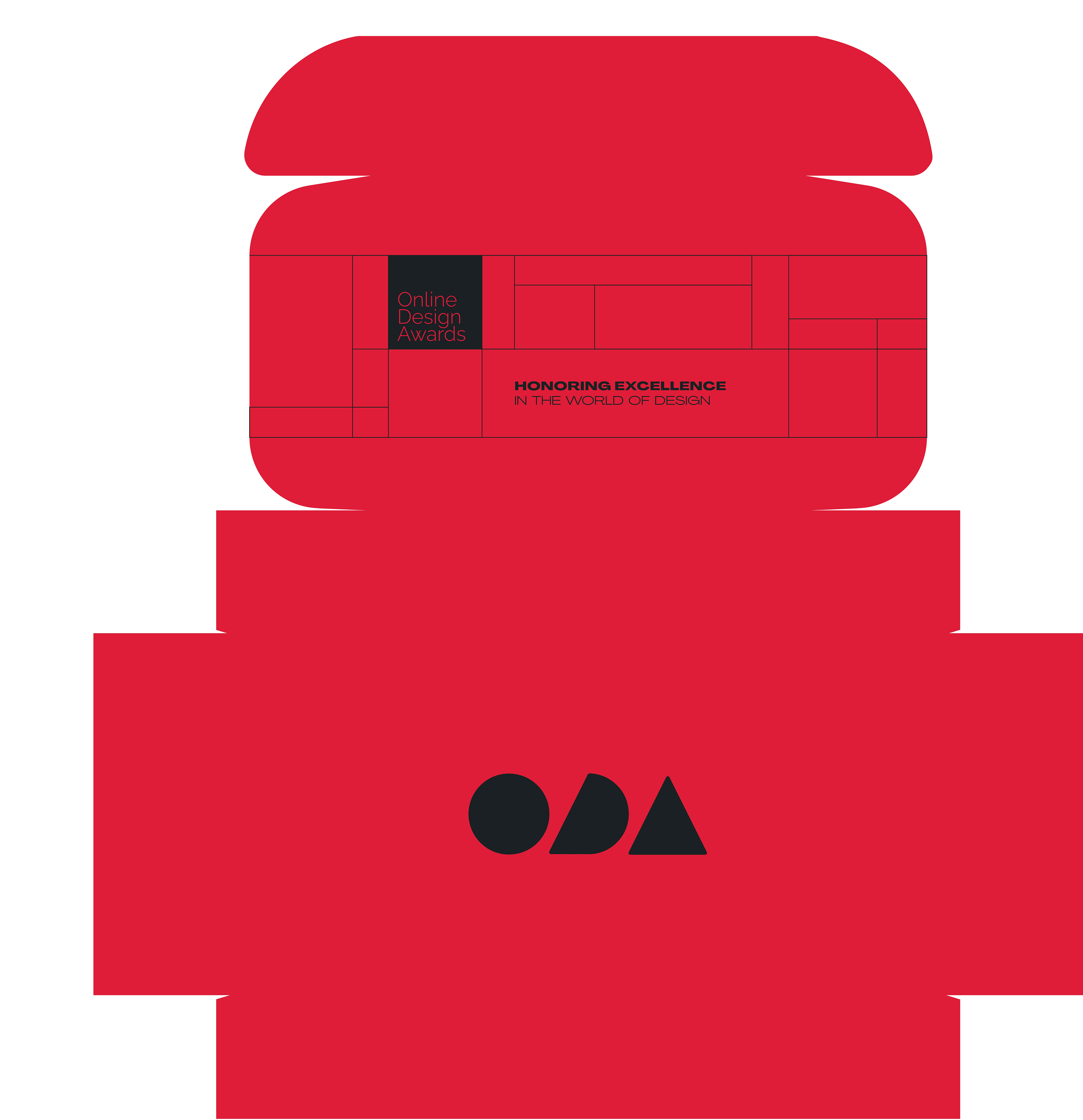
Before I started on the Awards Show, I designed print deliverables that were packaged in this PR box I designed and sent to the nominees and winners.
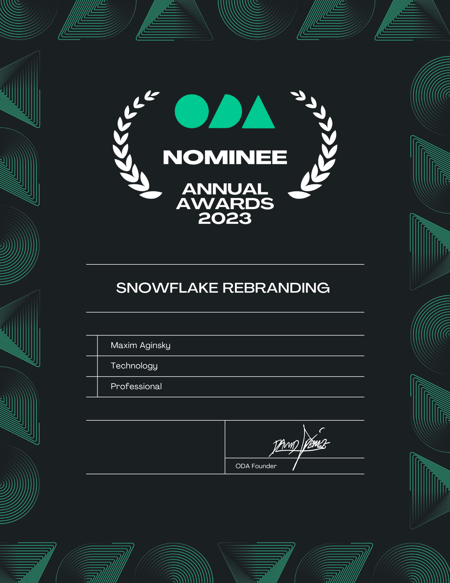
I designed and automated the certificates using Google Sheets that my team helped populate. The colors of the certificate borders corresponded with the category colors we defined in the Awards Show.
The print deliverables used this stylized ODA logo, which felt like a perfect bridge between print and motion because it uses lines in a way that has logic but also feels fun, decorative, and has movement to it. It looks snazzy as a pattern for the PR box, a border for the certificates, and an element that encapsulates what this year’s Awards Show is all about.
I’m so grateful that I had such a huge hand in bringing this emerging awards show run by honest, hardworking and kind people to life, and laying the groundwork for the ODA brand that will be prevalent in the future.

