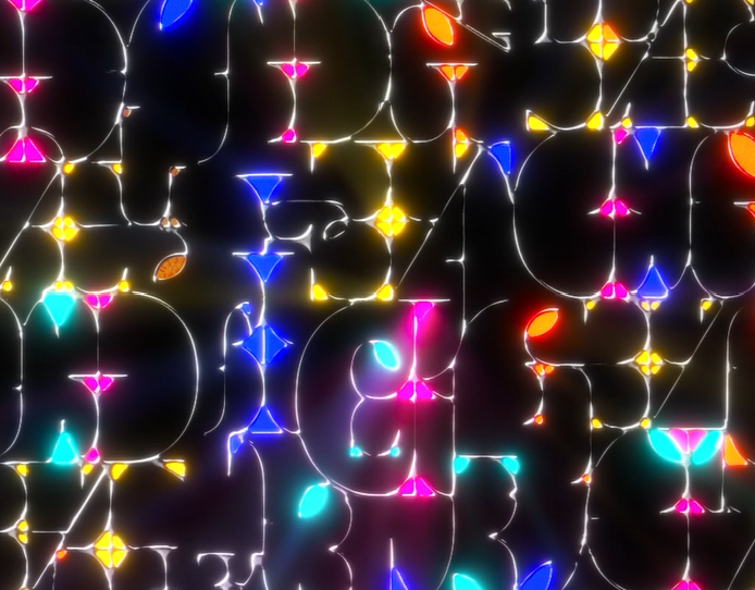
In my Principles of Motion Media Design course, I was assigned a 30s kinetic typography animation. The only parameters of the project were that it was preferred that we didn't use any supplemental graphics other than the text. I chose to do mine to Across the Universe by The Beatles.
The song was chosen because the lyrics were vivid and used lots of words that described movements, most of which I would use to sync up with my typography animations. This was a way that I could be expressive without using any art other than the type. Because the song came out in the early 70s, an era when psychedelic music and art was prominent, I adopted that style for my piece.
A common design technique in vintage psychedelic design was typography being warped to fit into or around a certain shape, so I used those techniques when manipulating the font I chose in Adobe Illustrator. This style also allowed me to make more representative graphics with the text instead of making new illustrations. Psychedelic animation is very fluid in style because everything would melt into each other so that's why I chose to animate the text with a liquid look.